Go Back to Projects
Logistics Data Query and Management Platform
2024 - 2025
UX/UI Design
PROJECT DETAILS
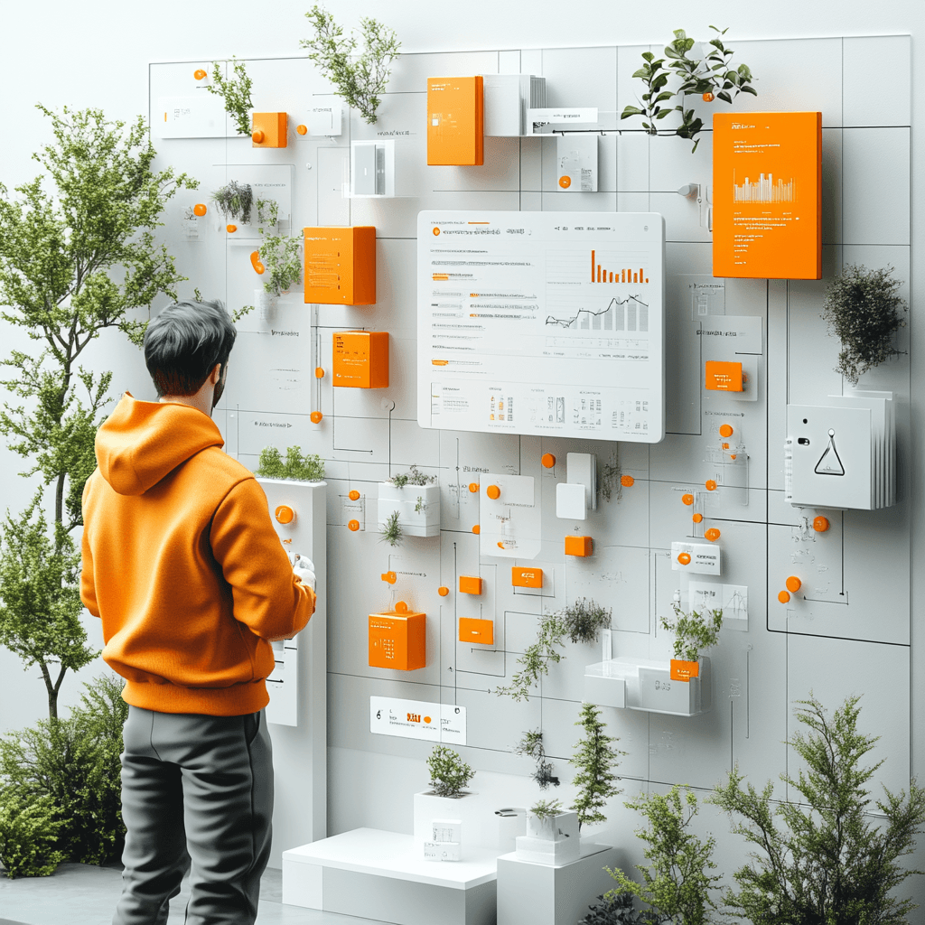
Designing a digital platform to optimize logistics data queries and enhance communication efficiency between KAMs and Fleet Managers. The project addresses key issues such as email overload and lack of real-time data accessibility.
Logista is a multinational logistics company with operations in 7 European countries, over 8,000 employees, and a highly complex organizational structure. The company needed to unify several internal tools used daily by its operational and commercial teams—mainly fleet managers and Key Account Managers (KAMs)—into a single, centralized digital platform.
These tools, previously disconnected and fragmented, led to inefficiencies, data duplication, human error, and a suboptimal user experience.
Our goal was to design a centralized platform that integrated all essential functions into a unified system, streamlining operations and improving the internal user experience.
1. Empathize – Qualitative and Quantitative Research
Goal: Deeply understand the end users and business stakeholders.
In-depth interviews: I conducted one-on-one interviews with real users of the current tools (fleet managers, KAMs, and technical staff) to understand their workflows, frustrations, routines, and expectations.
Stakeholder interviews: We also held sessions with product owners and operations leadership to align on business goals and technical constraints.
Structured interview guide: A semi-structured interview guide was developed to ensure consistency across sessions, covering key points such as:
What are your most frequent tasks?
What parts of the current tool are most frustrating?
How do you manage client information?
Do you rely on external tools (e.g., spreadsheets)?
Key insights uncovered:
Many tasks were still handled using Excel, leading to human error and loss of information.
Lack of real-time fleet tracking and control.
Task duplication across departments was common.
Most users had limited tech knowledge — simplicity and clarity became top priorities.
2. Defining the Problem
Based on our research, we created several user personas, focusing on the two most impacted roles:
Fleet Manager: Needs real-time control, alerts, and tracking.
KAM: Needs quick access to client information and easy report generation.
The central problem statement became:
“Users need a centralized platform that enables them to efficiently manage daily operations without errors, duplications, or fragmented workflows — with clear visibility across departments.”
3. Information Architecture – Sitemap
To logically organize the platform’s structure, we designed a comprehensive sitemap based on the prioritized functionalities identified in the research phase:
General Dashboard
Fleet Management
Client Management
Incidents & Support
Reporting
Admin & User Management
Why this was important:
A clear sitemap ensures scalability, intuitive navigation, and alignment between design, development, and business goals. It served as a foundation for early team discussions and stakeholder validation.
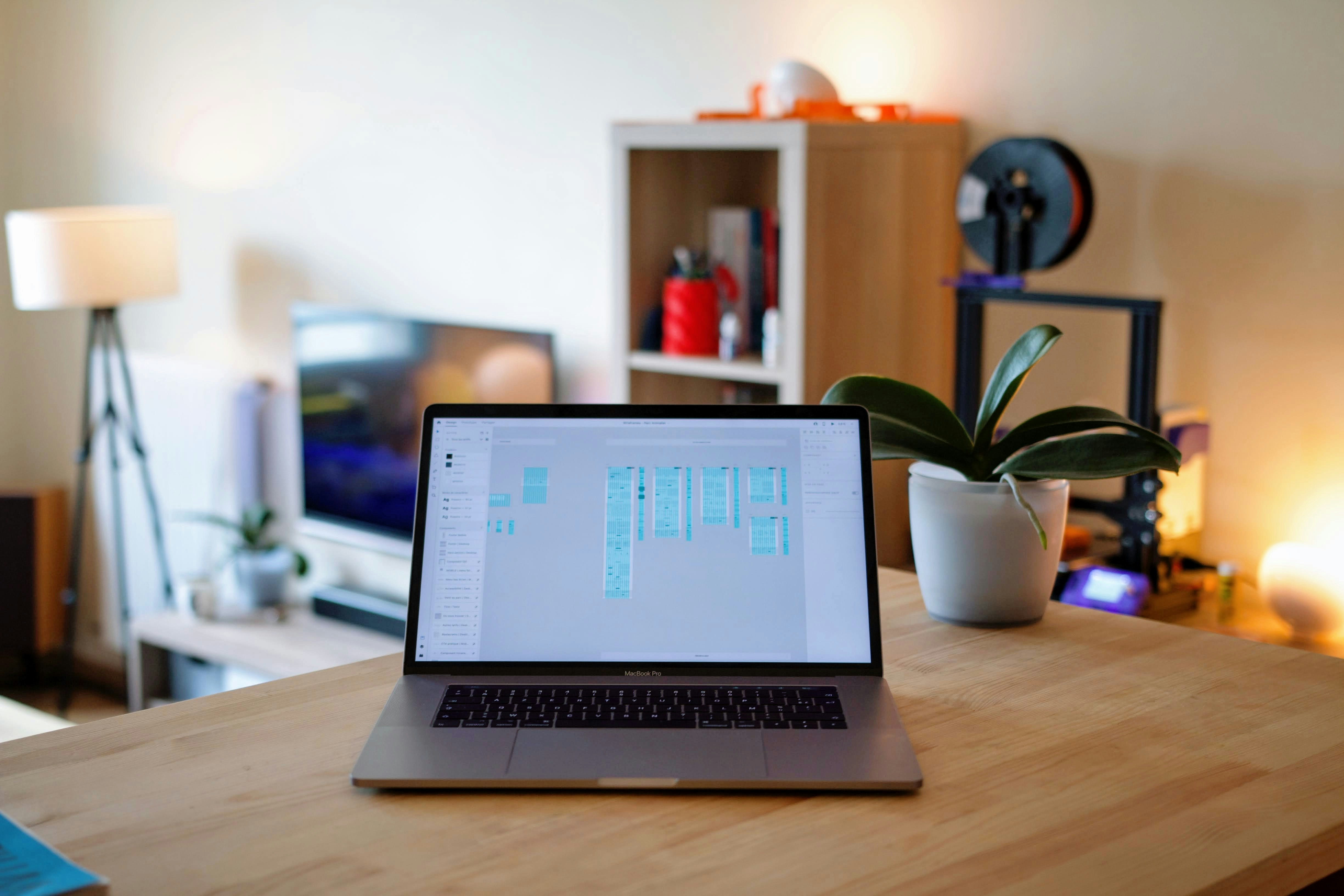
4. Ideation – Low-Fidelity Wireframes
Using the sitemap as a base, we developed low-fidelity wireframes to:
Validate navigation flows early on.
Identify usability issues quickly.
Iterate rapidly with stakeholders before committing to visual design.
Tools used: Figma + Figjam
We ran collaborative review sessions with real users using simple interactive prototypes. These sessions provided immediate feedback on usability and flow.
Positive outcomes:
We uncovered small but impactful improvements such as simplified filters, tab-based navigation, and quick-action shortcuts for repetitive tasks.
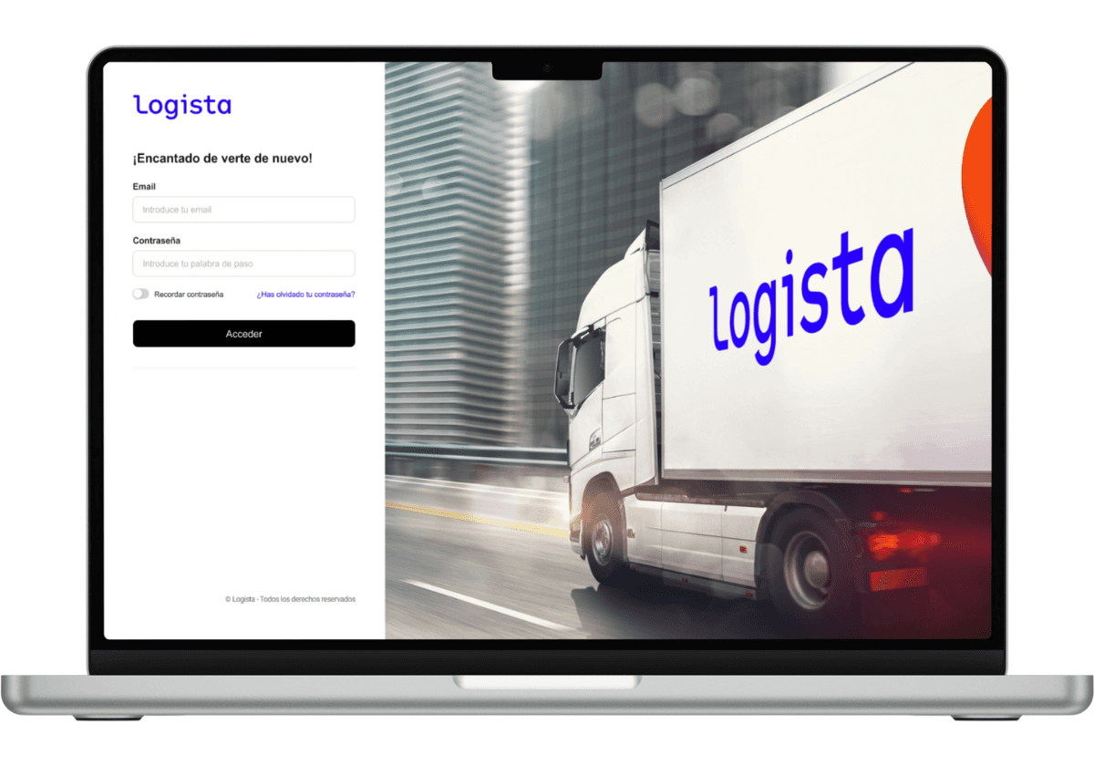
5. Iteration & Final UI Design
Once the wireframes were validated, we moved on to the visual design phase. This stage involved refining layout, establishing visual hierarchy, and aligning with Logista’s internal design system.
Key design decisions:
Use of neutral colors and high-contrast typography to enhance readability in high-focus environments.
Modular card-based layouts to simplify data scanning.
Universal, clear iconography to support multilingual users.
Responsive design to accommodate tablet use in logistics environments.
6. Interactive Prototyping & Testing
We created a fully interactive prototype in Figma, replicating real user flows. This prototype was tested in guided usability sessions using the think aloud technique.
Feedback received:
Users praised the visual clarity and layout.
Most users immediately understood the new workflows.
Several suggestions (like adding quick-access shortcuts or a dark mode) were included in the next iteration.
7. Impact & Results
The new tool reduced repetitive task time by 40%.
Excel reliance was eliminated entirely.
KAMs reported increased visibility and control over client accounts.
Internal satisfaction surveys showed a significant improvement in user sentiment.
Conclusion
This project is a clear demonstration of how a well-structured UX process — from research and empathy to prototyping and testing — can transform complex internal tools into intuitive, efficient, and valuable platforms for real users.